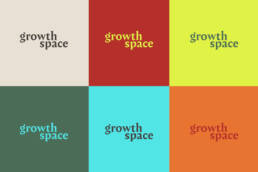
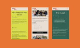
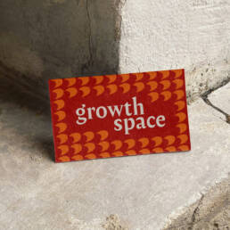
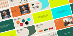
Growth Space works with leaders, teams and organisations to help business that need support with their strategic vision, culture or to empower leaders to grow. Growth Space needed something that would make the business align with the wealth of experience that Polly, the founder, had to offer and to help add to her existing client base. The brand identity needed to be distinctive, energetic, yet grounded in her knowledge and how she can help to create a ripple effect across businesses through the work she does. To make the brand more recognisable a friendly serif typeface was chosen and a logotype was designed intentionally in lowercase to reflect the conversational and human side of her work. The top of the 'g' had a distinctive flick that could be interpreted as a leaf, but we used it in a more abstract graphical way, as a harder block shape that created patterns becoming hard shadows. Working on the concept of a shadow being seen as projected future growth and expansion. When used in repetition it represented groups or individuals. This created part of the brand system to work in different ways across channels. The brand has created more stand out and with a suite of digital assets has given Polly a way to generate documents and content that is cohesive and individual.