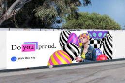
Vibrant student communications branding
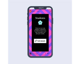
UWE Bristol needed their communications when students arrived to be distinctive, full of energy and flexible. With a variety of topics to convey from the excitement of exploring the campus to academic regulations and policies, as well as hard-hitting subject matter like sexual harassment and mental health, the visual language needed to be adaptable.
It's all about you
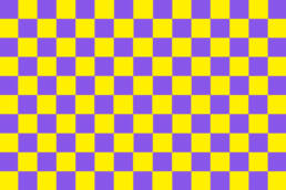
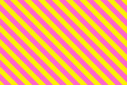
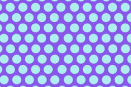
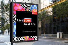
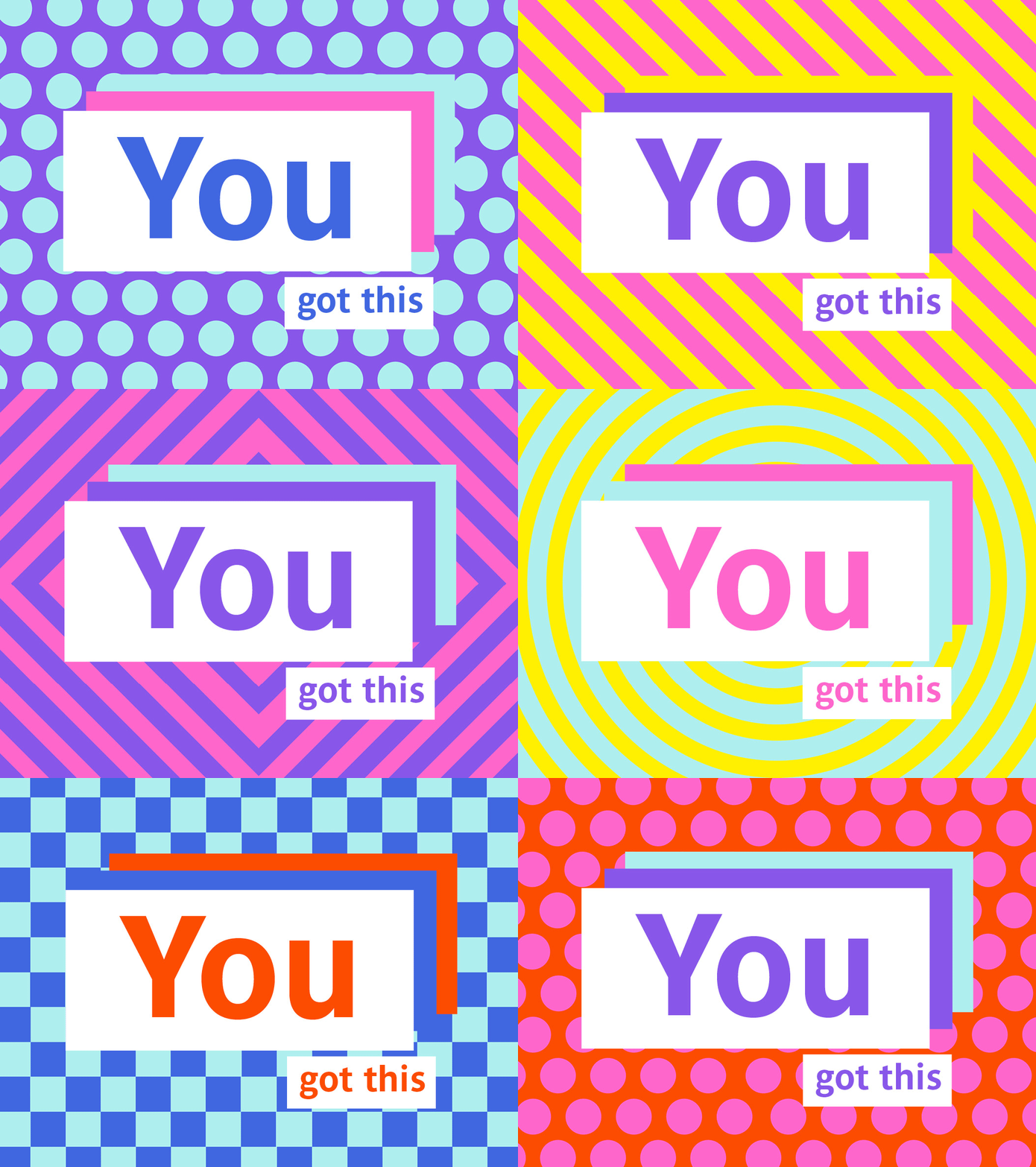
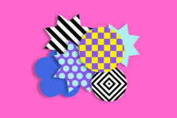
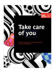
By extending the existing 3 UWE brand patterns to 5 (adding squares and dots), it helped create more versatility and by adding a 3D element it connected the all encompassing aspect of being in the physical environment, adding both depth and energy. A bold colour palette has been created to work alongside black and make the whole identity really ‘pop’.
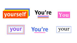
The tone of voice was specifically tailored to be more direct, talking to students and putting them at the centre. Using ‘you’, ‘you’re’, ‘yours’ etc in headlines and styling with emphasis on the wording.
Express yourself
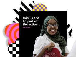
With all the elements sitting cohesively together the UWE Bristol Student Comms team are able to use them quickly and easily to create the variety of messages needed and to put their own stamp on the visual styling. Picking and choosing from a range of shapes, patterns, colours, as well as imagery playing its part by working as cut-outs immersed in the 3D and flat shapes.
You're in safe hands
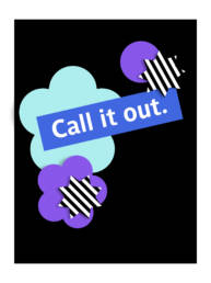
It was very important to take into account how serious some of the topics are, so the bold and flexible design system works to adapt to the messaging, bringing in a stripped back feel in both colour and styling to help with the change in tone.

